
Sometimes if you want to change the way things are done it’s better to bring a fresh perspective to the table. That seems to have been true for Denise Burt, who has built a ten-year career in designing classical music CD covers despite knowing nothing about the genre when she set out.
“I had no idea that music could tell so many stories, so many ideas,” she commented. “It’s made me a lot more open-minded.”
Burt has now brought out a book with 24 of her most iconic designs from the several hundred she has completed. Her design work has focused on contemporary classical music, seeking to work together with the composers and find experimental ways to present their music. The book is entitled Seeing New Music and was published by her design company.
Below is a selection of some of her most interesting designs gathered together by NPR.
Jexper Holmen, Oort Cloud
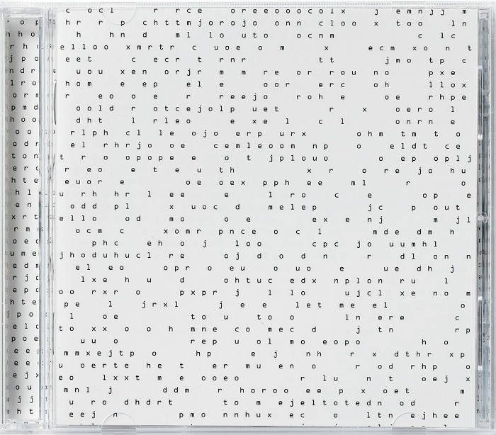
Holmen explained to Burt that the name of his CD, taken from the icy collections of mass found at the edge of the solar system, reflects the fact that like the universe, the music “doesn’t give a damn about you.” Burt took her inspiration from this sentiment in designing the art. She managed to fill 24 pages of the booklet with “gibberish,” prompting one critic to remark, “If prizes were awarded on the basis of user unfriendliness, this CD would be in line for a Pulitzer.”
Vagn Holmboe, Chamber Music (1)
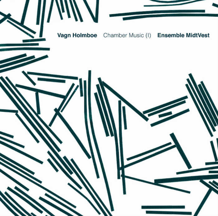
Holmboe had passed away by the time Burt came to design a cover for his chamber music, she still proved able to get a good idea of his approach to music-making. Burt thought that a picture of bacteria was a suitable reflection of “the metamorphosis” technique of composition employed by Holmboe.
David Lang, Death Speaks
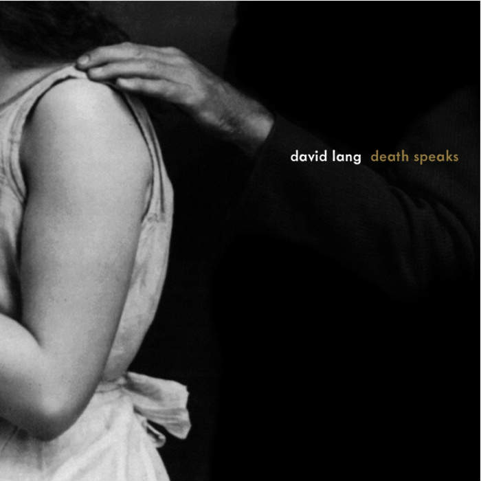
Burt’s challenge when designing lang’s CD was how to come up with an original presentation of death, arguably a subject which has been one of the most frequently portrayed throughout history. Her approach was to avoid a cliched picture of death as a terrifying spectre, and instead create an image of it as something which one should be comforted by and welcome.
Anders Koppel, String Quartets
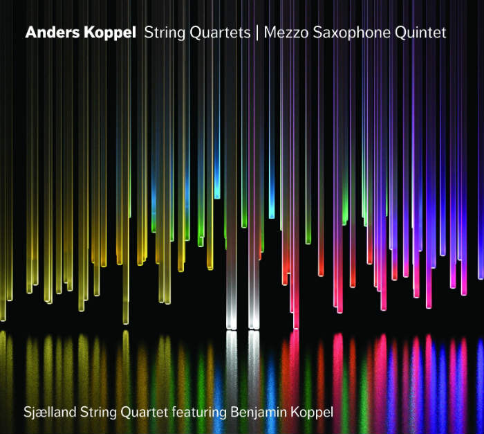
For this design, Burt’s creativity prompted Koppel to use the image for an entirely different CD than had originally been planned. The intention was for the cover to represent an orchestra, according to Burt, who said, “I wanted to represent each musician as a kind of beam of light.” But Koppel felt it suited his string quartet recording better, and this was the result.
Per Norgård, Libra
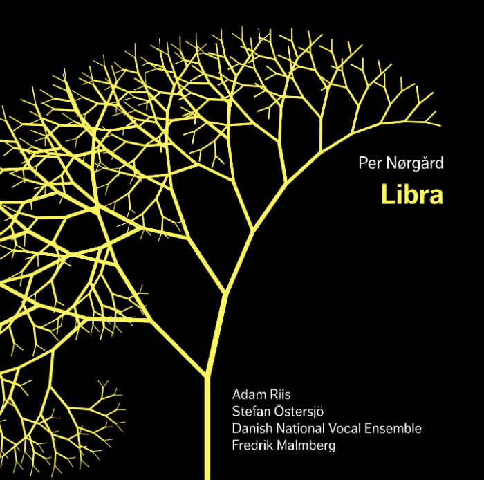
This is another example of Burt’s original approach to design. Rather than adopting a conventional presentation of the theme of balance, which is what Norgård’s piece was about, she drew inspiration from elsewhere.
Pelle Gudmundsen-Holmgreen, Mixed Company
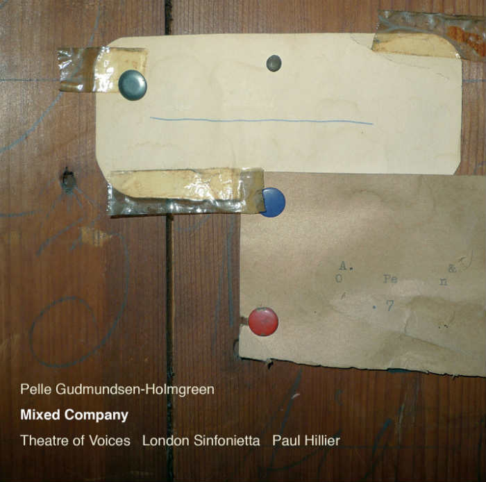
According to Burt, Gudmundsen-Holmgreen explained that he “wanted something completely neutral” on the cover to his CD. This led her to select this picture of an attic door, which she told NPR has nothing to do with the music at all.
Peter V. Swendsen, Allusions to seasons and weather
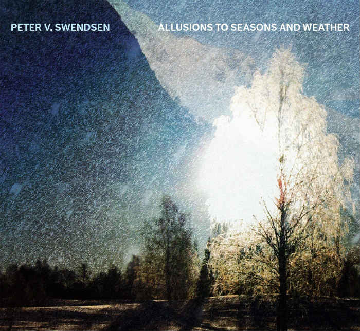
Swendsen’s style of music involves recording sounds in unusual landscapes, and making use of electronics and new technologies to create sounds. As well as writing musical scores, he also conducts research in these areas. Burt wanted to stay true to his approach to recording, so she combined photos he had taken while on site in Norway to create a collage for this cover.
Terry Riley, In C
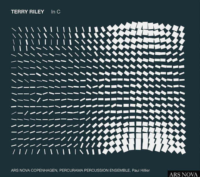
Riley’s compositions fall in to the minimalist approach, which is based on a series of short phrases. Burt endeavoured to reflect this in her design, resulting in this grid-like creation.